Black support
About the Project
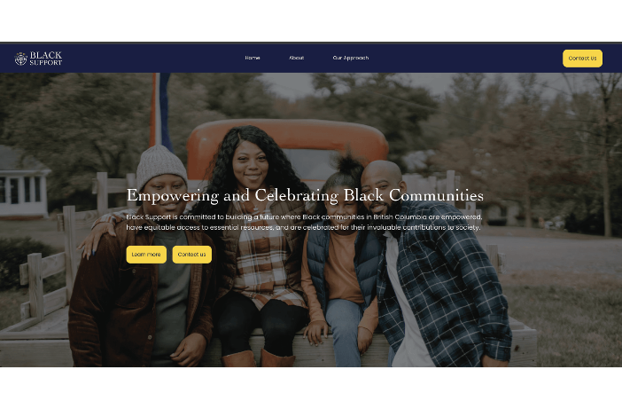
Focused on the Lower Mainland, its mission is to empower these communities by connecting local businesses offering essential services at affordable prices with individuals and families who need them most. The organization acts as a bridge, strengthening relationships between business owners and communities while celebrating Black culture, resilience, and entrepreneurship. Recognizing that credibility and trust are central to its mission, Black Support required a brand identity that serves as a visible trust signal, standing out in public spaces and digital channels while communicating unity, support, and celebration.


Discovery and Understanding
The process began with in-depth interviews with the founders to understand their vision and expectations. These conversations revealed not only what they were looking for in a brand identity but also how they imagined the organization evolving across different sectors in the future. To translate this vision into design, we hosted a co-creation workshop where we collaborated with the founders to generate a set of noun words that captured the essence of the brand such as terms like community, celebration, support, trust, growth, and belonging. These words became the foundation for our design exploration.
At the same time, we conducted market research to analyze how other community-focused organizations and nonprofit initiatives were presenting themselves. This included studying existing Black-led organizations in British Columbia, how they present themselves visually and verbally, how community-based brands communicate trust and belonging, and what tone feels supportive rather than extractive or trauma-centered. We looked closely at color systems, symbol codes, and design strategies that communicated trust, inclusivity, and credibility.
This research revealed what to avoid: The identity should not feel clinical, corporate, or centered only around struggle. Instead, it needed to feel human, joyful, culturally rooted, and connected. From the conversations and research, we distilled the brand into core themes and built a list of words that are synonyms or visual metaphors to support them.
design exploration
We began with analog sketching to explore visual metaphors for community and growth. Over two days, we sketched around 100 logo concepts by experimenting with circles, roots, hands, seeds, gatherings, and shared upward movement. From those sketches, we developed 12 mid-fidelity vector directions, each expressing the core themes in a different way. From this combined process, we developed multiple identity directions, each rooted in both the founders’ input and industry insights. As the project progressed, the founders emphasized the need for an identity system that could flex across multiple services and sectors, from community programs to trade services and beyond. This insight guided our design choices toward creating not just a logo, but a scalable brand system capable of adapting to diverse applications while maintaining a consistent core identity.