Clarity View Counseling
– Brand & Website
Understanding the Client
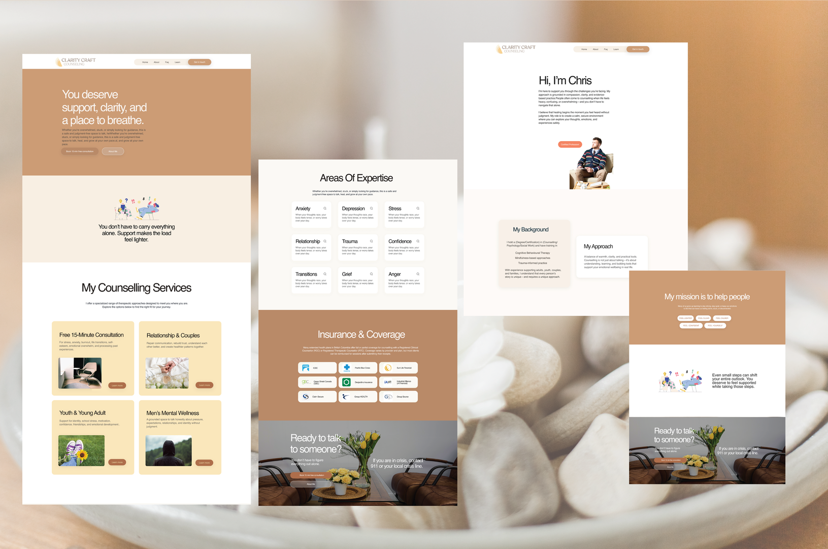
Christopher’s therapeutic approach is grounded, non-judgmental, and practical, and the brand needed to express these same qualities. He wanted a presence that felt human, warm without feeling sentimental, and respectful without talking down to clients. This guided the creation of a brand voice that communicates empathy with maturity and clarity.Christopher also emphasized the need for practical clarity.
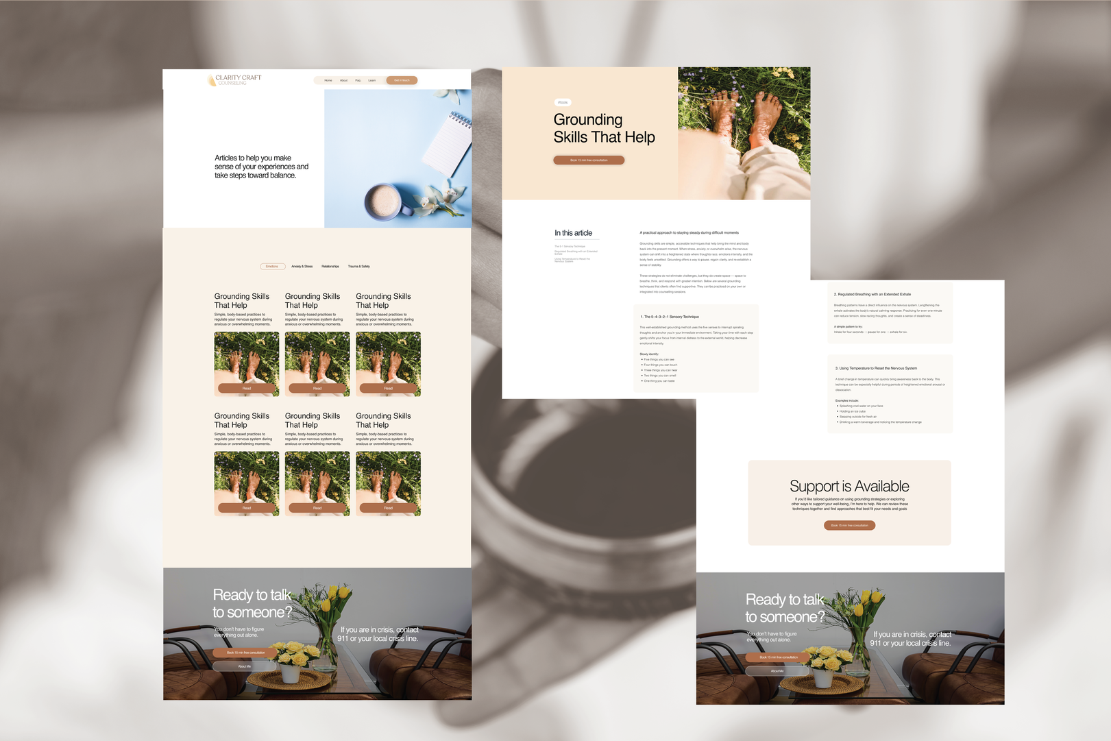
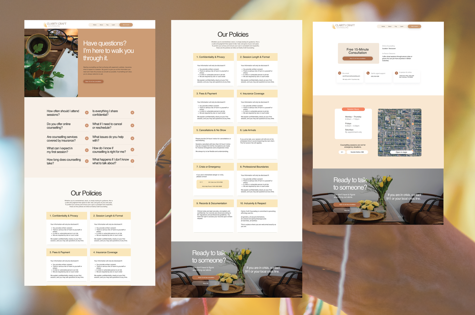
Many people who consider therapy feel overwhelmed by unknowns, so the experience needed to explain the essentials simply: how sessions work, what clients can expect, what insurance covers, how long therapy might take, and what the therapeutic process feels like. This requirement directly shaped the site’s structure, ensuring each interaction reduced cognitive load and increased confidence.

Understanding the Users
People seeking therapy often arrive feeling overwhelmed, anxious, or uncertain, so the design needed to meet them with clarity and emotional safety. Research and conversations with potential clients surfaced three key user types: the Overwhelmed Professional dealing with burnout or identity stress, the Worried Mind navigating overthinking or social anxiety, and the Life-Transition Seeker coping with major personal changes.
Across all groups, the same needs emerged: simple information, reassurance, and a sense of being understood. Many users don’t know what therapy involves, worry about insurance or commitment, and feel intimidated by dense language.These insights shaped the entire UX approach. Content became shorter and more direct, the voice became warm and non-clinical, and the interface prioritized space, readability, and gentle hierarchy. The goal was to reduce friction, build trust quickly, and support users in moving from uncertainty to taking action with confidence.