Darby Drywall
About client
The company provides drywall installation, taping, and finishing services for renovation, residential, and commercial projects, and has been operating for two years. The business has grown primarily through reputation and referrals, driven by consistent workmanship, clean finishing, and honest communication. However, the existing brand identity did not reflect the quality of the work or the trust earned on job sites. To support continued growth and strengthen perception, the company needed a visual identity that communicates dependability, experience, and grounded expertise for both contractors and homeowners.
Discovery and Understanding
The project began with a detailed conversation with the owner to understand the company’s story, values, work ethic, and long-term goals. It became clear that reliability is at the core of the company’s identity. Darby Drywall does not cut corners, does not exaggerate, and treats clients and their homes with respect. The brand needed to represent a steady, confident presence rather than an overly bold or flashy personality.
Approach
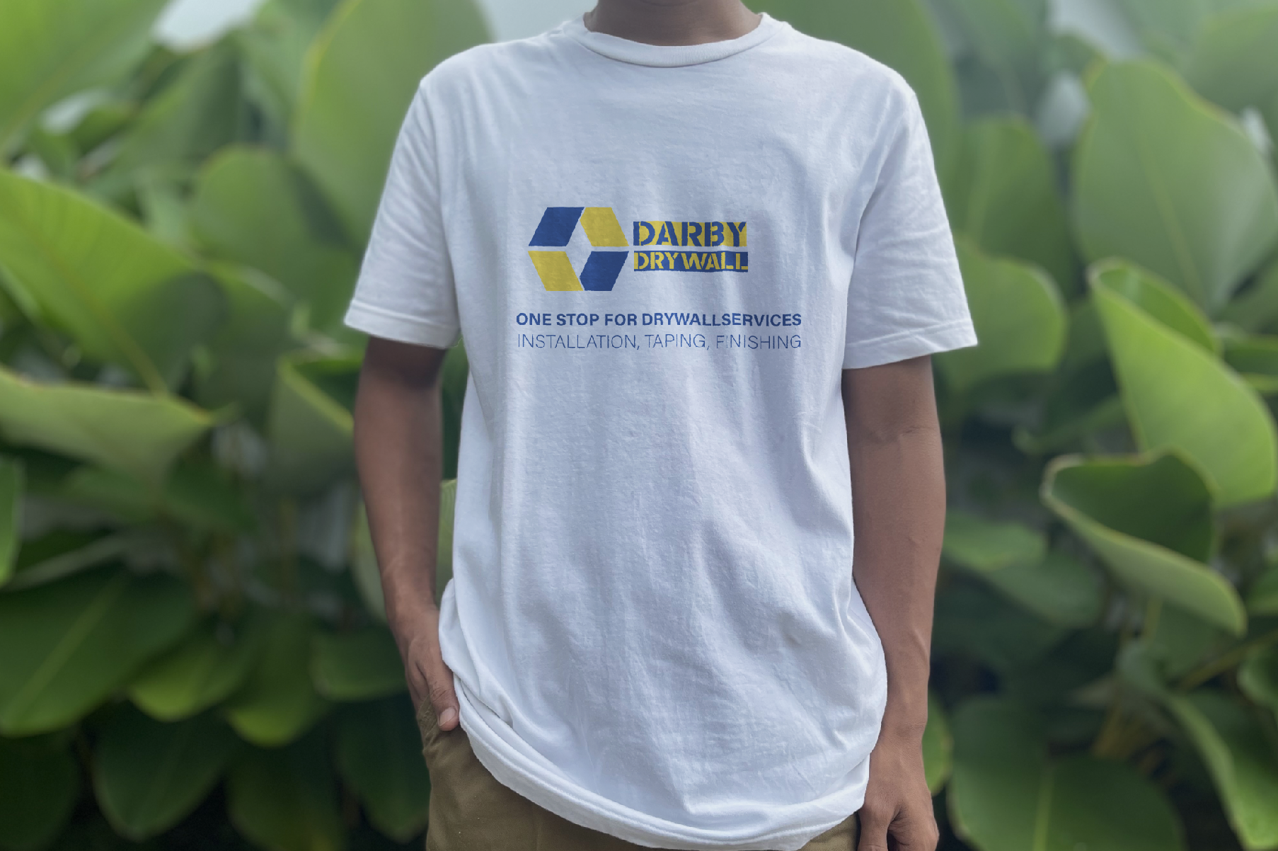
Market research was conducted to examine how drywall and construction companies typically present themselves. The research focused on visual languages, color palettes, typography choices, and messaging conventions. Many competitors used loud colors, aggressive tones, or cluttered layouts, and very few communicated professionalism or care. This confirmed that the brand should feel clean, clear, and straightforward, with a calm and confident tone. Stakeholder research was also completed to understand who interacts with the brand most frequently, including contractors, homeowners, developers, and other trades. We identified where the brand would appear in real environments, such as uniforms, vehicles, signage, invoices, and online platforms. This helped establish the need for a consistent identity system rather than a standalone logo.


